WasteWorks
WasteWorks is a tech company that uses different systems to give value to negative value waste, such as that found in trash heaps and pulled from our oceans.
SERVICES
Name and Tag Line Consultation, Logo Design, Brand Guidelines, Pitch Deck Presentation, Print Collateral, Web Design & Development
The Name
Originally called “Waste to Wealth,” the client wanted a new name that was easier to remember and better fit their objectives, as well as a tag line that would help identify the brand. After a few brainstorming sessions and meetings, we came away with the new name, “WasteWorks,” and the tag line “All Trash Has Value.” The brainstorming went so well that we also came away with a name for the app, SCRAPS, an acronym for “Socially Conscious Recycling And Payment System.”
The Logo
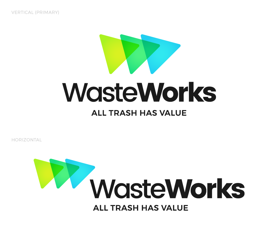
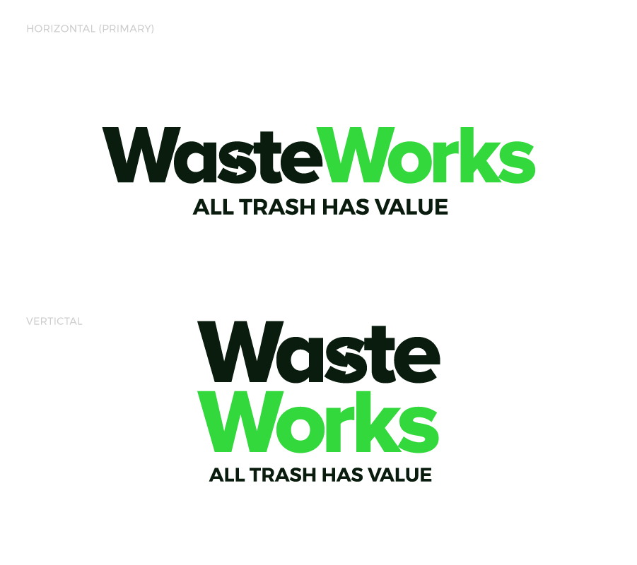
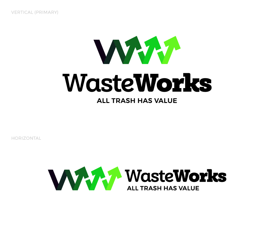
With a new name in hand, the client wanted a logo that would symbolize the process, a major component to WasteWorks’ strategy. After reviewing their competitors and the tech arena they wanted to target, I also found it important to have a logo that was modern, clean and approachable. Combining the idea of process and technology with the letter “W,” I landed on three strong concepts that each gave a slightly different vibe.
The first option being more techy/digital, the second more non-profit, and the third landing somewhere in between. Color choice was designed to reflect the recycling and earthy nature of the brand and reinforce each of the different logos’ ideas. The sans serif typography of the first two options and the rounded minimal slab serif type of the third helped maintain the clean, modern approach.
The Brand & Print
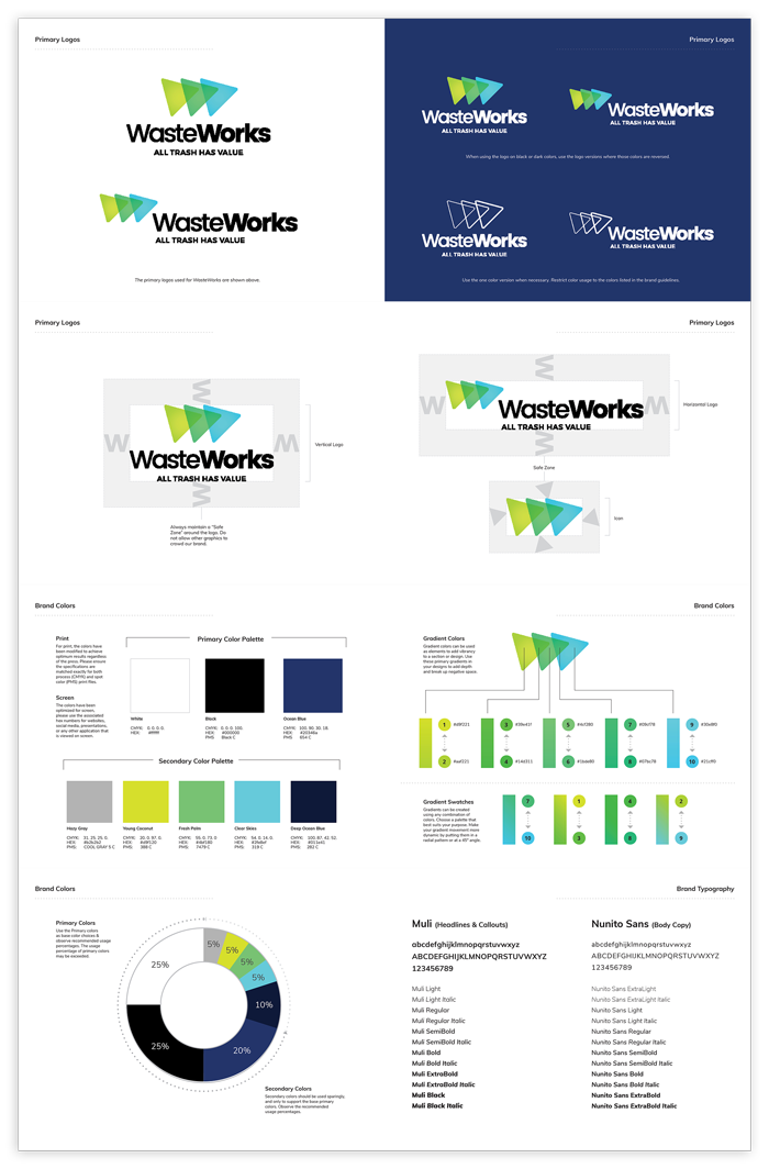
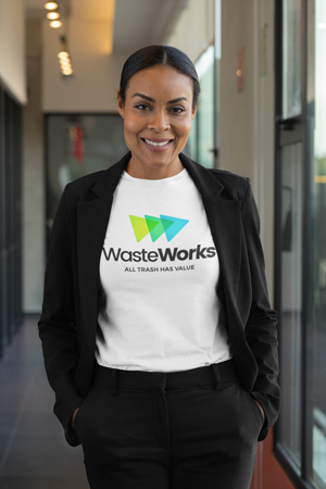
After selecting the first logo option, the goal was to create a brand that reflected the reasons they chose it. The bright colors were designed to stand out and garner attraction, so I went with dark backgrounds of navy and black to help them pop. The triangles in the logo work well as accent elements for things like photo frames or bullet points. To help visualize the brand in the real world, mockups and print collateral were created.
The Presentation
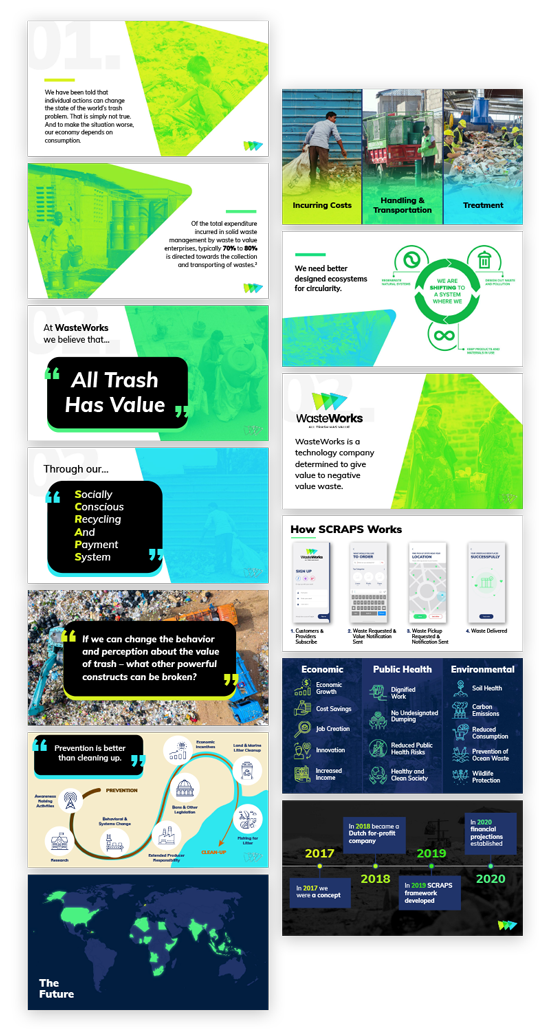
A critical goal discussed early on in the project was a pitch deck that would help explain the ideas behind WasteWorks and SCRAPS to potential investors and people of interest. With the brand established, the presentation could be created with the identity that would help expand WasteWorks’ reputation. Meticulous care was given to ensure the flow of the presentation was fluid and easy to understand, while also displaying WasteWorks’ identity throughout.
The Website
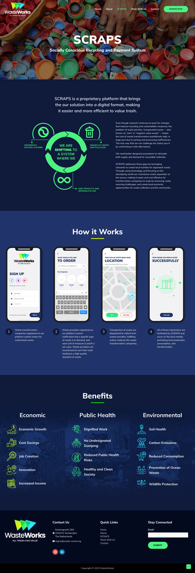
The client had three goals for the website–stand out amongst other recycling-like programs, simply, but effectively, communicate data and info, and not have a site that was scary or intimidating. To do this I went light on the text and heavier on photos and graphics. The idea was to explain as much as possible using color, visual cues and easy to digest infographics. The final result was a website that both the client and I came away very happy with for its approachability, singularity and efficiency.
