Rebrand Logofolio
A collection of some of my favorite logos I've rebranded over the last few years. Each logo & brand had its own set of objectives to consider for the redesign and as such each presented its own unique challenges.
BELLA REINA SPA
BEAUTY & DAY SPA
REBRAND GOALS
Convert to all black color scheme, make slightly more approachable for male audience while still maintaining female vibe, simplify icon so that it ties into logotype better and makes “BR” stand out more, and add “& Beauty” to the service line.
CONNECTED WARRIORS
VETERAN-CENTRIC WELLNESS CENTER
REBRAND GOALS
Maintain same general look of old logo, exchange the grungy look for a more modern, clean aesthetic, and make typography more legible and cohesive.
DANIELLE H. BRATEK
TRADEMARK ATTORNEY
REBRAND GOALS
Keep full name, add service line of “Trademark Law,” modernize the typography, and adjust color scheme to get away from gray and reflect a more professional aesthetic.
ELEGANT AFFAIRS
EVENT PLANNING & CONSULTING
REBRAND GOALS
Create a more unique, boutique-like logo, update brand to be more sophisticated and elegant, and create a color palette that works for both corporate events and weddings.
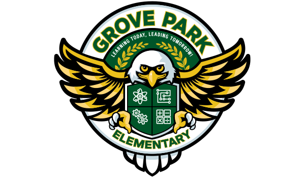
GROVE PARK ELEMENTARY
ELEMENTARY SCHOOL
REBRAND GOALS
Reduce aggressiveness of eagle mascot and make it more kid friendly/elementary school age appropriate (without getting too cartoony), simplify color palette by getting rid of gradients and reducing to six solid colors, adjust icons to better represent subjects, emphasize “Grove Park,” and add tagline.
KIDSAFE FOUNDATION
PERSONAL SAFETY EDUCATION FOR CHILDREN
REBRAND GOALS
Create brand with a more compassionate and approachable identity, create a unique icon/mark that illustrates inclusiveness and safety, simplify typography for broader national appeal, and update color scheme to reflect relationship to kids.
LUKE'S ALL NATURAL PET FOOD
PET SUPPLY STORE
REBRAND GOALS
Adjust name to “Luke’s Natural Pet Market,” modernize look of brand, making it cleaner and easier to use in various media, and create an icon unique to Luke’s location in South Florida.
MIZNER INDUSTRIES
CUSTOM HAND-PAINTED TILES
REBRAND GOALS
Change name to “Mizner Tile Studio,” drop icon completely, change to copper and blue color scheme, and give logotype a more artistic, hand-crafted feel.
SOUTHEAST FLORIDA PEST CONTROL
PEST CONTROL
REBRAND GOALS
Maintain primary red and black color scheme, preserve the vibe/feel of the old logo and look of the ant mascot, while giving it more “children’s book-like” qualities, change name to “Barry Bugs,” and make the overall look more female friendly (for a new target audience), as well as classic, clean and fun.
